So, I went through some of my previous work to see which ones do work. One thing I do wanna stress is that these are my personal opinion based on my limited experience. Rather than discussing what doesn't work, I will show few examples that do work. Then we can see the underlying principle in those images. These are pics I shot during the Annual 2012 slut-walk in London Ontario.
Example (1)

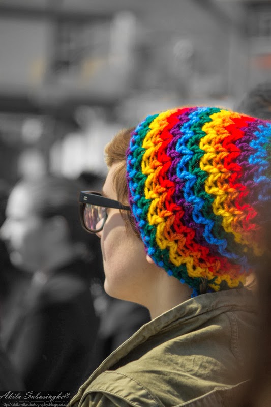
Example (2)
Example (3)

One main factor in these 3 examples are the fact that the color is used as a tool to guide and hold the viewer attention on the subject. This is specially useful when the background is busy/not completely blown/blurred out. In my view, all 3 examples work for these images in different ways. So, one thing to keep in mind is to never apply this technique to all pictures you take. It is certainly not a method to make a boring picture interesting (same problem with many HDR work I see out there).... but more of a tool to control where the viewer gaze at. So for an example, in a picture of a car, if we color pop a telephone booth in the background, we will fail at achieving our main objective.. which is to engage the viewer with the subject (the car in this example).
One really important thing to remember not to over saturate the colored areas in the picture. In all the above examples, I simply De-saturated the surrounding area and left the colored region in tact for the most part.
So hope this will guide you to do better selective color images in the future. Would love to hear any comments on counter arguments etc.
Please note that all pics are copyrighted and are not to be used without the author's written consent.
Thank you!
Akila.
Hi Akila , really nice Blog.keep it up bro...
ReplyDeleteThanks Thimal. Glad it was helpful.
ReplyDelete